Custom tuning tips for your apps from the new API Usage Center
This month, DocuSign introduced a feature that monitors the health of your integrations. Don’t worry—this health assessment doesn’t involve stern advice from your doctor about blood pressure or other vital signs. Instead, the new API Usage Center evaluates the efficiency of your DocuSign API integrations. Why does efficiency matter? A more efficient integration optimizes throughput by following best practices, which provides a better experience for your users. It also scales more easily as volume increases. Available in your developer and production accounts, the API Usage Center currently reflects activity from these DocuSign APIs:
Apps and integrations: a review
The API Usage Center screens described below reference several DocuSign platform terms. Here’s a quick review.
If you want to include DocuSign technology in your app, web site, or system, you write custom code that we refer to as an integration. For each integration, an app must be defined in eSignature Admin. An app is a set of parameters that specify an integration's access to the DocuSign platform. These parameters include an integration key, which is an auto-generated GUID identifier required for authentication, and a redirect URI, which is the URI to which DocuSign will redirect the browser after authentication. In addition to being identified by an integration key, an integration is identified by a user-defined, descriptive app name. You can see a list of apps associated with your DocuSign developer account on the Apps and Keys page. The terms app and integration are frequently used interchangeably.
Efficiency scores
At the heart of the API Usage Center is the new Efficiency Engine. Our engineers have devised an algorithm that analyzes API activity history for each integration, pinpoints any inefficiencies, assigns an overall efficiency score, and generates a custom report that includes details on performance issues and recommendations for addressing them.
Below is an API Usage Center component that lists information about each integration under an account, including an efficiency score.
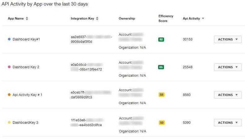
Figure 1: Sample API activity by app with efficiency scores
Scores range from zero to 100; the higher the score, the better. Scores are updated daily based on API activity over the previous seven days. From this component, an Actions button retrieves the efficiency report for each integration. The report components are described below.
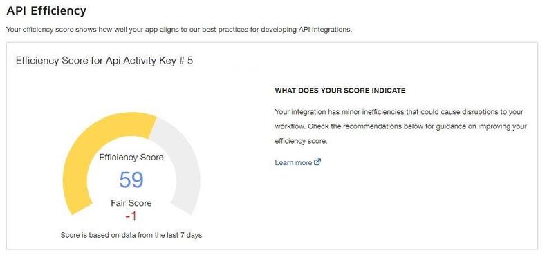
Figure 2: Sample efficiency score, rating, and change
In addition to the raw efficiency score, the component shown above provides a rating of Good, Fair, or Poor. This gives you a general indication of whether the integration is performing well or, if not, how severe the inefficiencies are. The change in score since the previous day is also displayed so that you can tell whether performance is improving or deteriorating.
Factors that negatively affect efficiency
Another component, shown below, provides insight into the Efficiency Engine analysis of your integration by listing the factors that are reducing its efficiency. By addressing these issues, you can enhance integration performance. The factors are listed in order of greatest to least impact on the score. To achieve the most improvement quickly, tackle the factors at the top of the list first.
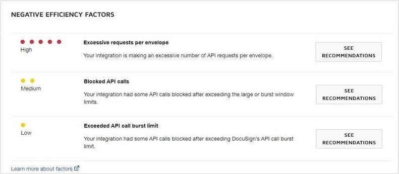
Figure 3: Sample list of factors reducing efficiency
This component lists only those factors that the Efficiency Engine has identified as detracting from performance. The Developer Center has a complete list of factors that are evaluated when determining an efficiency score.
Addressing efficiency issues
Finally, for detailed information about how you can address any factor that’s reducing efficiency, you can select See Recommendations to display a list of recommendations like the one shown below.
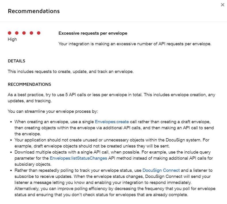
Figure 4: Sample recommendations for efficiency improvements
By implementing these best practices for your integrations, you can improve their efficiency. You’ll see the effect of your fixes in the API Usage Center every day after the Efficiency Engine updates scores. Progress indicators include:
- The change in score since the previous day
- The change in rating from Poor or Fair to Good as the improved score crosses the rating thresholds
- For each factor you addressed successfully, its severity will be reduced over time from High or Medium to Low. It will drop off the Negative Efficiency Factors list entirely when the problem has been completely resolved.
Additional monitoring tools
In addition to efficiency scores and recommendations, the API Usage Center offers several other tools to monitor your integrations. Examples are shown below.
This component displays a graph of API calls per hour for all integrations under an account.
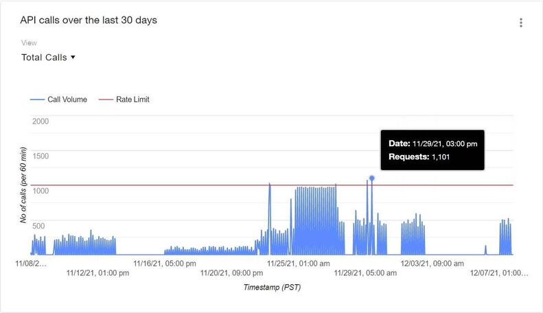
Figure 5: Graph of API calls over time
A few things to note:
- The red line shows the API call rate limit, so that you can easily see when activity approached or exceeded limits.
- The callout, displayed by hovering over a point on the graph, shows the call volume for a specific hour.
- The display can be customized to show a different date range, activity for selected integrations, or only successful or failed calls.
You can click a point on the graph to access more granular information, including total API calls by integration during a one-hour window, a list of calls made and details about each one, and a downloadable call log.
Other API Usage Center components enable you to view more detailed information about API call totals per integration, in various customizable formats, like the chart shown below.
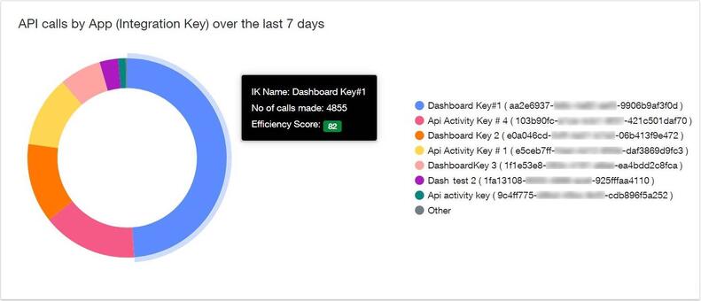
Figure 6: Chart of API calls over time by app
Suggestions welcome
The API Usage Center can get you started on the road to more optimized, scalable integrations. We hope you’ll check it out, and please send feedback or suggestions for future enhancements using the form at the bottom of the API Usage Center page.
